
A good bedroom color scheme does more than make a room look nice. It shapes how the space feels at night, in the morning, and during the small quiet moments in between. The wrong palette can make a bedroom feel flat, cold, heavy, or chaotic. The right one can make it feel calm, soft, layered, and pulled together without much effort.
That is why bedroom color planning should not stop at paint. Wall color matters, but bedding, curtains, rugs, wood tones, lighting, and accent decor do most of the heavy lifting. A cozy bedroom usually depends on warmth, texture, and balance. A stylish bedroom depends on contrast, restraint, and materials that look intentional instead of random.
The good news is that you do not need a huge budget or a professional designer to make a bedroom feel better. You just need a color scheme that fits your room, your light, and the mood you want. Some bedrooms need bright, airy tones to feel open. Others need richer shades to feel grounded and restful.
These bedroom color schemes are built for real homes and real decorating decisions. Each one gives you a clear palette, practical styling direction, and ideas you can actually use.
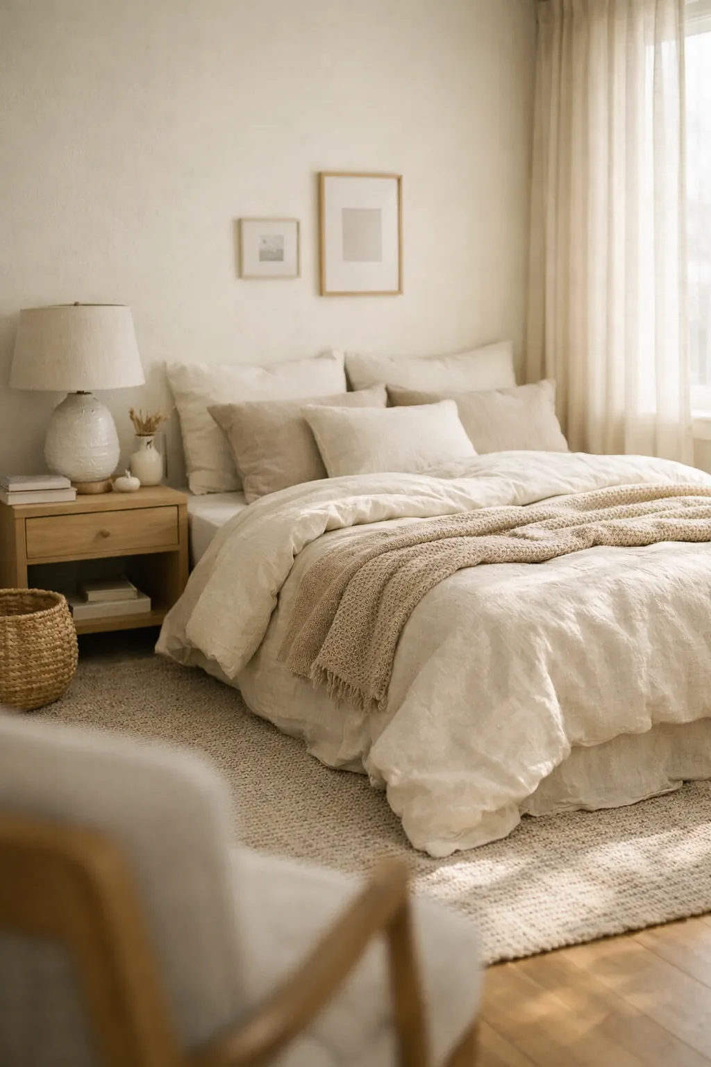
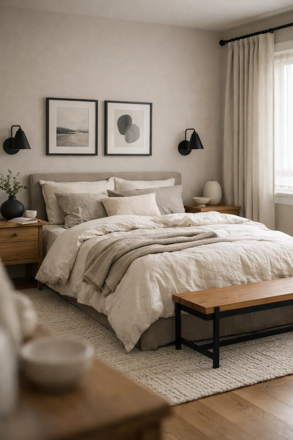
1. Warm White and Beige
Warm white and beige is the easiest color scheme to live with because it feels soft without looking dull. It gives a bedroom that quiet hotel-like calm that many people want, but it still feels warmer and more personal than a plain white room.
The trick is choosing warm whites instead of icy whites. Pair them with beige, sand, oatmeal, or soft taupe tones. This creates a layered neutral look that feels clean and cozy at the same time.
This palette works especially well in:
- small bedrooms
- guest rooms
- minimalist spaces
- bedrooms with limited natural light
Use warm white on the walls, then build depth with beige bedding, a textured cream rug, linen curtains, and light wood nightstands. A woven bench, ceramic lamp, or nubby throw helps keep the room from feeling flat.
A real example would be a bedroom with creamy white walls, an oatmeal upholstered headboard, beige striped bedding, and pale oak furniture. That kind of room looks polished without being stiff.
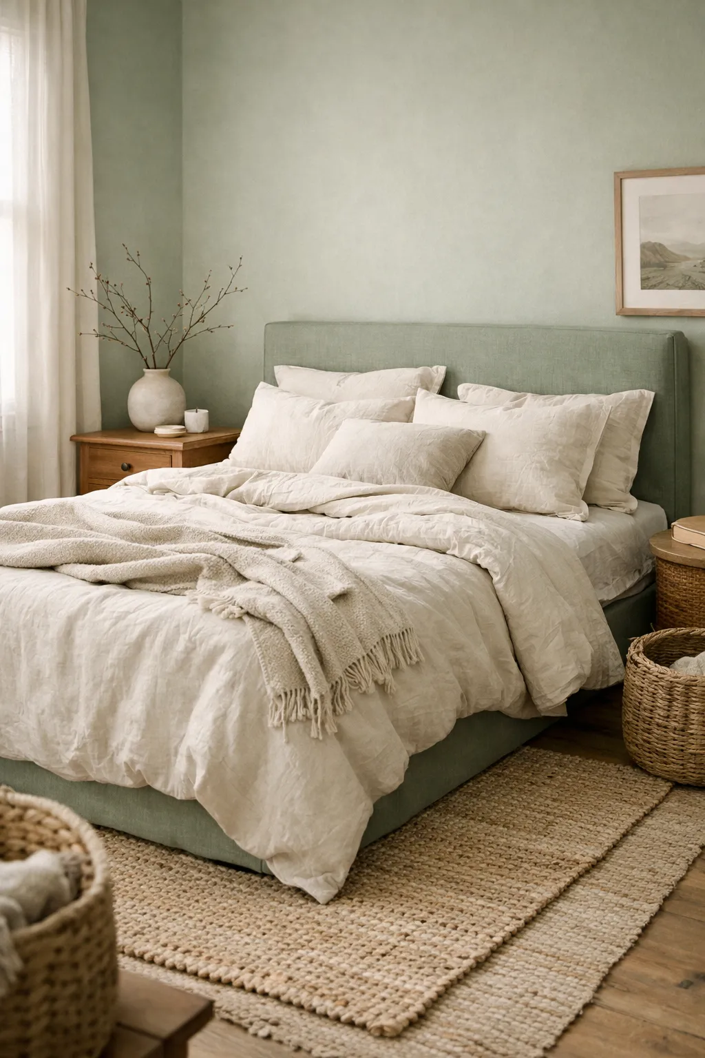
2. Sage Green and Cream
Sage green and cream is one of the most reliable cozy bedroom pairings because it feels restful, natural, and easy on the eyes. It brings in color without making the room feel busy.
Sage works best when it is muted and slightly dusty, not too bright and not too gray. Cream softens it and stops the space from feeling cold. Together, they create a grounded palette that works well in modern, cottage, transitional, and organic-style bedrooms.
To style it well, use:
- sage walls or sage bedding
- cream or ivory sheets
- warm wood furniture
- woven baskets
- antique brass or black metal accents
This color scheme looks better with natural textures than shiny finishes. Matte paint, washed linen, raw wood, and woven materials make it feel lived-in. High-gloss surfaces will make it feel less cozy and more staged.
If you want the room to feel richer, add a little olive, muted clay, or darker green through pillows or art. That keeps the palette interesting without breaking the calm effect.
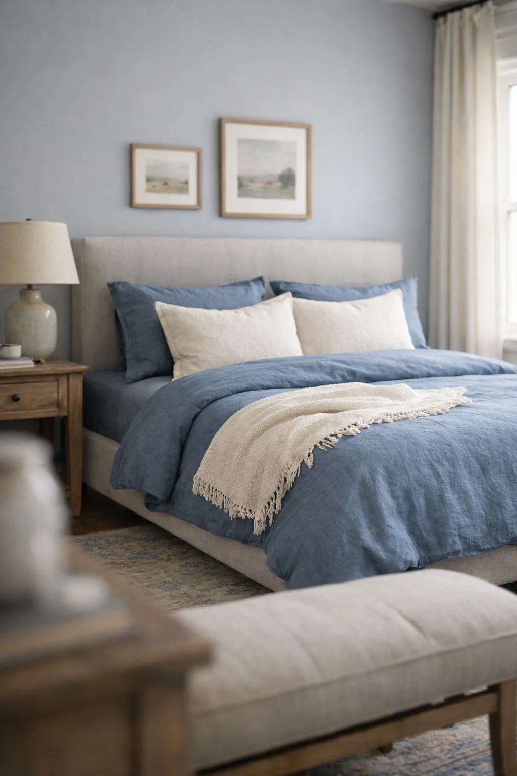
3. Dusty Blue and Soft Gray
Dusty blue and soft gray creates a cool-toned bedroom that still feels relaxed instead of chilly. The problem with many blue bedrooms is that they end up looking too crisp or too nautical. Dusty shades fix that.
This scheme works best when the blue is muted and the gray is soft, not harsh. Think foggy blue, faded denim, or blue-gray instead of bright sky blue. That gives the room depth and a quiet, settled feel.
This palette is a good fit for:
- bedrooms with lots of sunlight
- clean classic interiors
- guest bedrooms
- people who want calm without using beige
The easiest way to use it is with gray walls and dusty blue bedding, or the reverse if you want more color impact. Add white sparingly. Too much bright white can make the room feel colder than you want.
A better choice is soft ivory or pale greige mixed into the bedding and curtains. Then bring in texture with a tufted headboard, knit throw, or vintage-style rug.
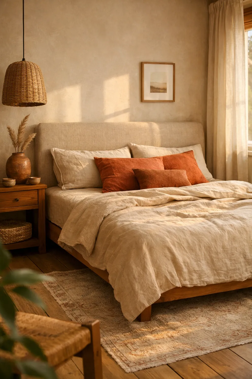
4. Terracotta and Sand
Terracotta and sand is warm, earthy, and more interesting than standard neutrals. It gives a bedroom a sunbaked softness that feels cozy, relaxed, and slightly collected over time.
Terracotta does not need to be loud. In fact, it looks better when it leans muted. Think clay, cinnamon, faded rust, or desert rose rather than orange. Sand tones help balance it and keep the room from feeling too heavy.
This palette works well in:
- boho bedrooms
- Mediterranean-inspired spaces
- organic modern interiors
- neutral rooms that need warmth
You can use terracotta through a painted accent wall, lumbar pillows, throw blankets, artwork, or upholstered pieces. Sand works well as the base through bedding, curtains, rugs, and larger furniture.
This is a smart palette for people who think beige bedrooms feel too safe but do not want bold color. It adds warmth fast without overwhelming the room.
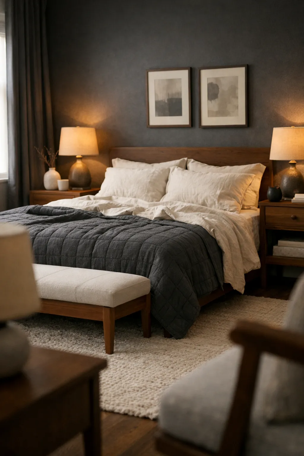
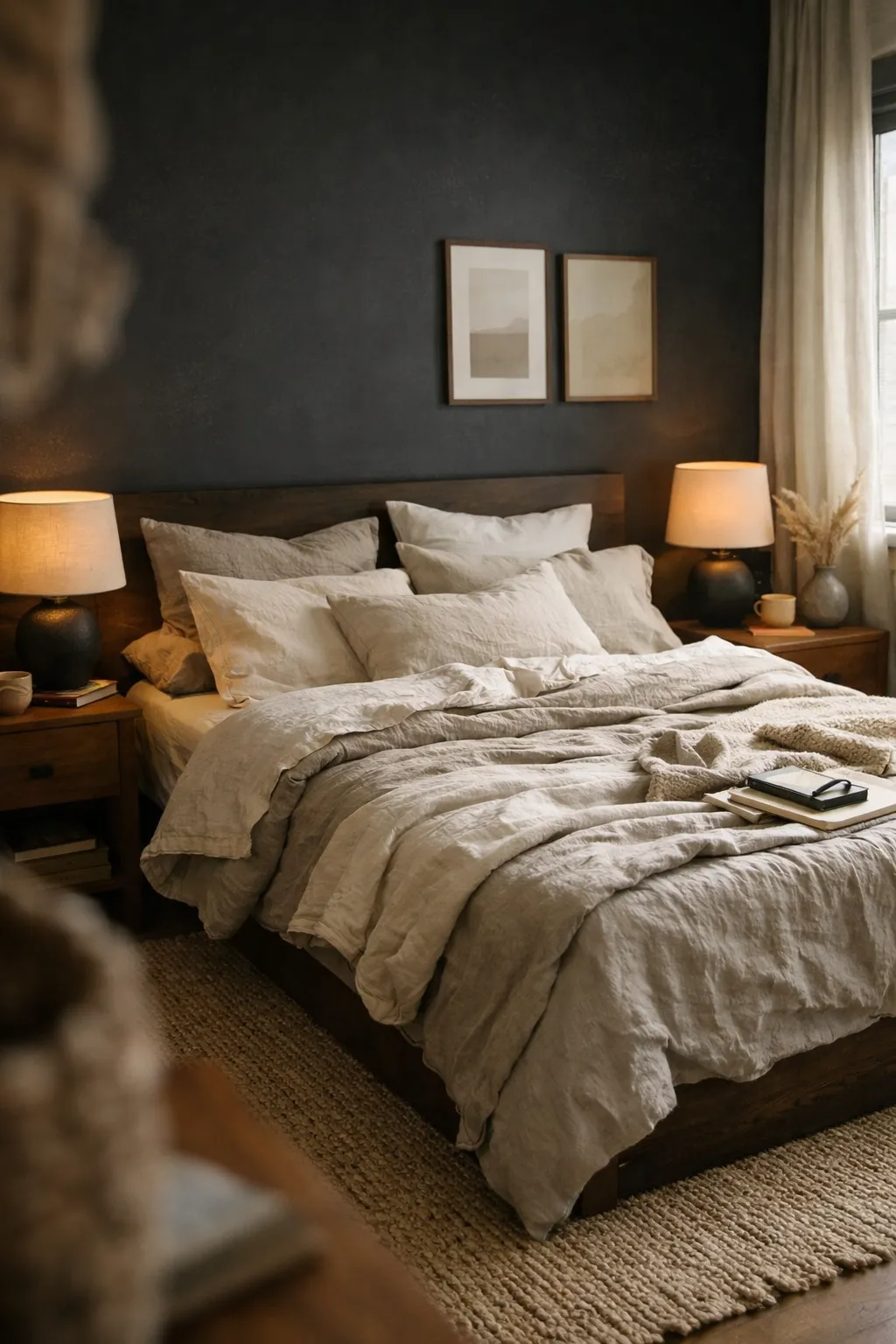
5. Charcoal and Ivory
Charcoal and ivory is for people who want a bedroom to feel dramatic but still livable. Done badly, it can feel too dark and severe. Done right, it feels rich, modern, and deeply restful.
The secret is balance. Charcoal should not swallow the room. Ivory should soften it and reflect light back into the space. This pairing works especially well in larger bedrooms or rooms with decent natural light.
To make it feel cozy instead of sharp, use:
- charcoal in bedding, accent walls, or curtains
- ivory in sheets, rugs, and upholstery
- warm wood for contrast
- soft lighting from lamps instead of relying only on ceiling light
Black can work here too, but charcoal is usually the smarter choice. It gives depth without looking as hard. Add texture wherever possible. Flat dark walls and flat dark bedding will look dead fast.
A charcoal quilt, ivory linen sheets, walnut nightstands, and a warm table lamp can make a room feel expensive without much decoration.
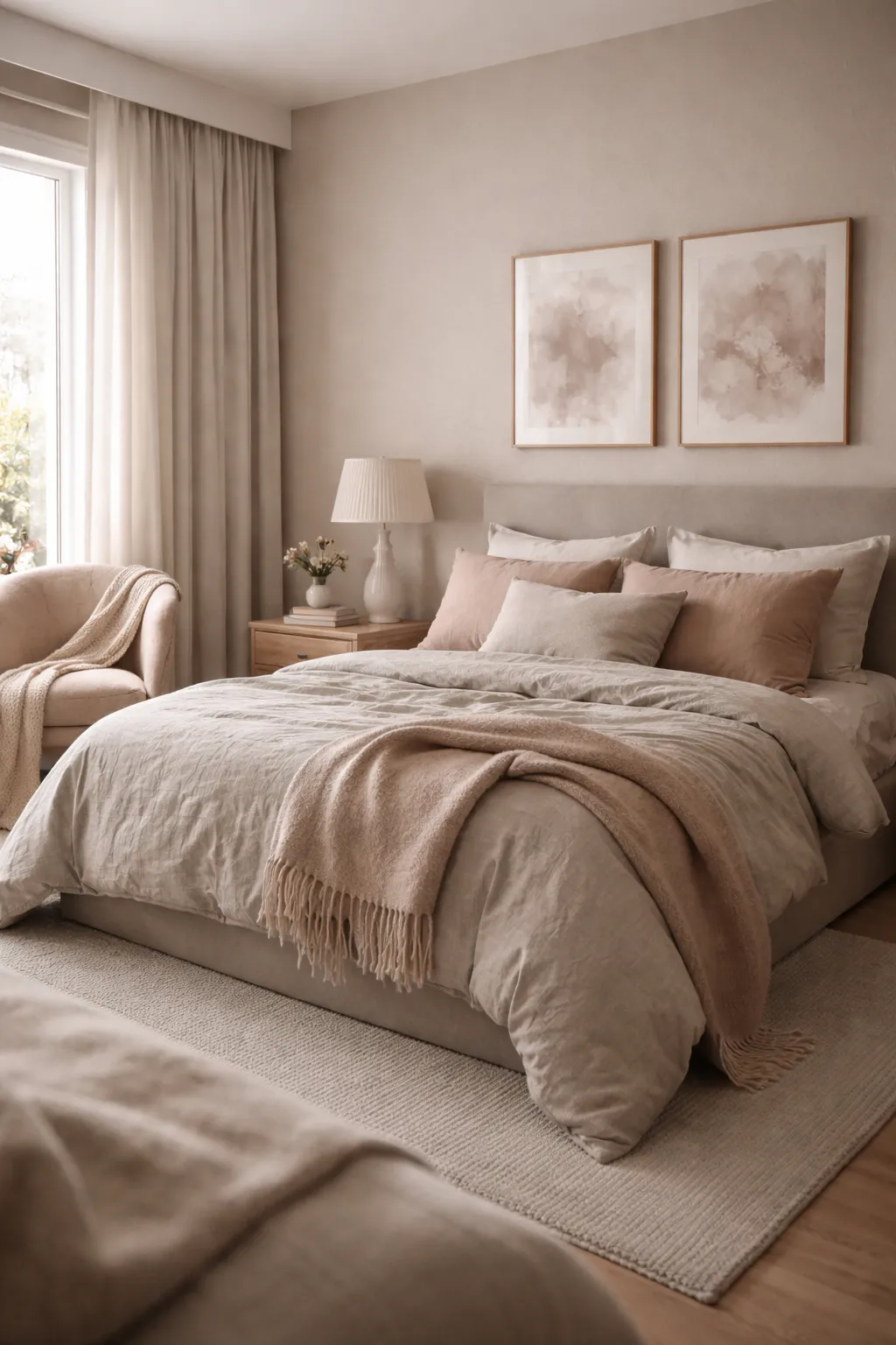
6. Blush and Taupe
Blush and taupe is one of the easiest ways to add softness to a bedroom without making it look childish or overly sweet. The problem is that many people use the wrong blush. If it is too pink, the room can feel dated. If it is muted and dusty, it feels calm and grown-up.
Taupe keeps blush grounded. It adds depth, maturity, and warmth. Together, they create a bedroom that feels soft, polished, and inviting.
This scheme works especially well in:
- feminine but not overly decorative bedrooms
- small bedrooms that need warmth
- transitional and soft modern styles
- rooms with upholstered furniture
Use blush in smaller doses if you are unsure. A taupe room with blush pillows, art, and a throw is often more stylish than a full blush wall. You can also reverse it with a muted blush wall and taupe bedding if you want a little more personality.
Keep the finishes soft. Linen, brushed cotton, matte ceramics, and warm metals work better here than glossy white furniture.
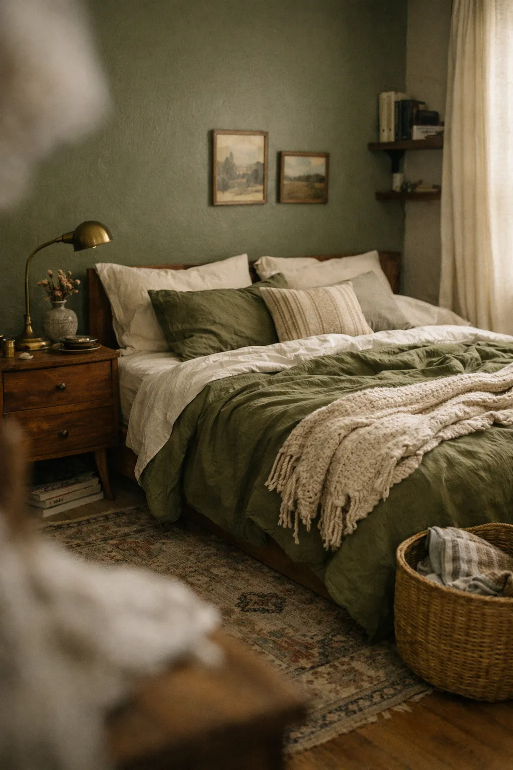
7. Olive Green and Warm Wood
Olive green and warm wood creates a bedroom that feels grounded, relaxed, and a little moodier than sage. It has more depth and more character, which makes it a strong choice if you want color without going bright.
Olive works well because it reads almost like a neutral in the right setting. It pairs naturally with walnut, oak, vintage brass, tan leather, and cream textiles. That makes it easy to build a room that feels layered without feeling messy.
This scheme is ideal for:
- cozy primary bedrooms
- rustic-modern spaces
- masculine or gender-neutral bedrooms
- fall-friendly decor that still works year-round
An olive accent wall behind the bed can look great, but olive also works through bedding, curtains, and accent chairs. Then use warm wood furniture to keep the room feeling natural and anchored.
One of the best real-life versions of this palette is olive bedding, cream sheets, walnut nightstands, a vintage-style rug, and soft beige curtains. It feels styled, but not forced.
Bedroom Color Scheme Comparison Table
| Color Scheme | Mood | Best For | Watch Out For |
|---|---|---|---|
| Warm White and Beige | Soft and airy | Small rooms, minimalist bedrooms | Can feel flat without texture |
| Sage Green and Cream | Calm and natural | Organic, cottage, transitional styles | Can look dull if too gray |
| Dusty Blue and Soft Gray | Peaceful and cool | Sunny rooms, guest rooms | Too much white can feel cold |
| Terracotta and Sand | Warm and earthy | Boho, Mediterranean, relaxed spaces | Bright orange undertones ruin it |
| Charcoal and Ivory | Moody and refined | Larger bedrooms, modern interiors | Too much dark can feel heavy |
| Blush and Taupe | Soft and polished | Feminine, soft modern bedrooms | Bright pink looks juvenile |
| Olive Green and Warm Wood | Grounded and rich | Cozy primary bedrooms, rustic modern spaces | Too many dark tones can close in the room |
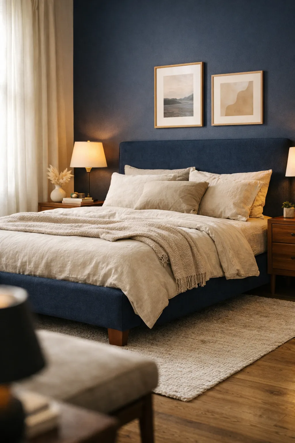
8. Navy and Beige
Navy and beige is one of the strongest bedroom color schemes if you want contrast without going too sharp. Navy gives the room structure and depth. Beige keeps it soft enough to feel inviting instead of formal.
This pairing works because beige takes the edge off dark blue. A full navy-and-white bedroom can look crisp, but it can also feel a little cold or coastal in a way that does not suit every home. Beige makes it warmer and more grounded.
This color scheme works well in:
- classic bedrooms
- modern traditional spaces
- larger rooms that need depth
- bedrooms with high ceilings
Use navy where you want visual weight. That could be the wall behind the bed, a quilt, velvet pillows, or long curtains. Then bring in beige through the headboard, rug, bedding layers, and lampshades.
A smart version of this look might include a navy upholstered bed, beige linen bedding, warm wood nightstands, and a vintage rug with muted blue tones. That looks intentional and cozy. A bad version would be too much bright white and shiny chrome, which can make the room feel stiff.
9. Greige and Black Accents
Greige and black accents is a clean, stylish choice for people who want a bedroom that feels modern but not cold. Greige gives you softness and flexibility. Black adds structure and just enough contrast to stop the room from fading into itself.
The reason this works is simple. Many all-neutral bedrooms look nice in photos but feel weak in real life. They need visual anchors. Black hardware, frames, lamps, or bed details give the eye somewhere to land.
This scheme is a good fit for:
- modern bedrooms
- apartment spaces
- minimalist homes
- people who like neutrals but want a sharper finish
Use greige as the main base on walls or large textiles. Then add black in small, controlled doses:
- iron curtain rods
- black-framed art
- matte black sconces
- a black bench base
- a thin black stripe in a rug or pillow
Do not overdo it. Too much black can make the bedroom feel harsh fast. This palette looks best when softened with warm woods, off-white bedding, and textured fabrics like linen or cotton.
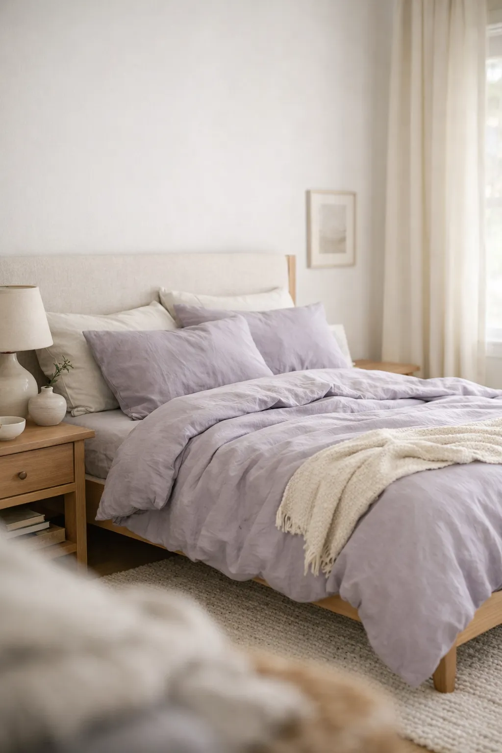
10. Muted Lavender and Soft White
Muted lavender and soft white gives a bedroom a quiet, pretty feel without turning it into a theme room. This is where people often get it wrong. Bright purple is a bad idea for most bedrooms. Muted lavender, on the other hand, can feel airy, calm, and surprisingly sophisticated.
Soft white helps keep lavender light and relaxed. The combination works best when both shades are dusty and understated. Think heather, faded lilac, or gray-lavender instead of candy purple.
This palette works well in:
- smaller bedrooms
- feminine spaces with a grown-up feel
- spring-inspired bedrooms
- rooms that need a little color without heavy contrast
A realistic setup could include soft white walls, muted lavender bedding, beige curtains, and natural wood furniture. That keeps the room balanced. If you add silver, mirrored furniture, or glossy finishes, the space can start to feel dated.
For a better result, use matte finishes and tactile materials. A lavender throw, washed cotton pillowcases, and a cream rug will feel more current than anything too polished.
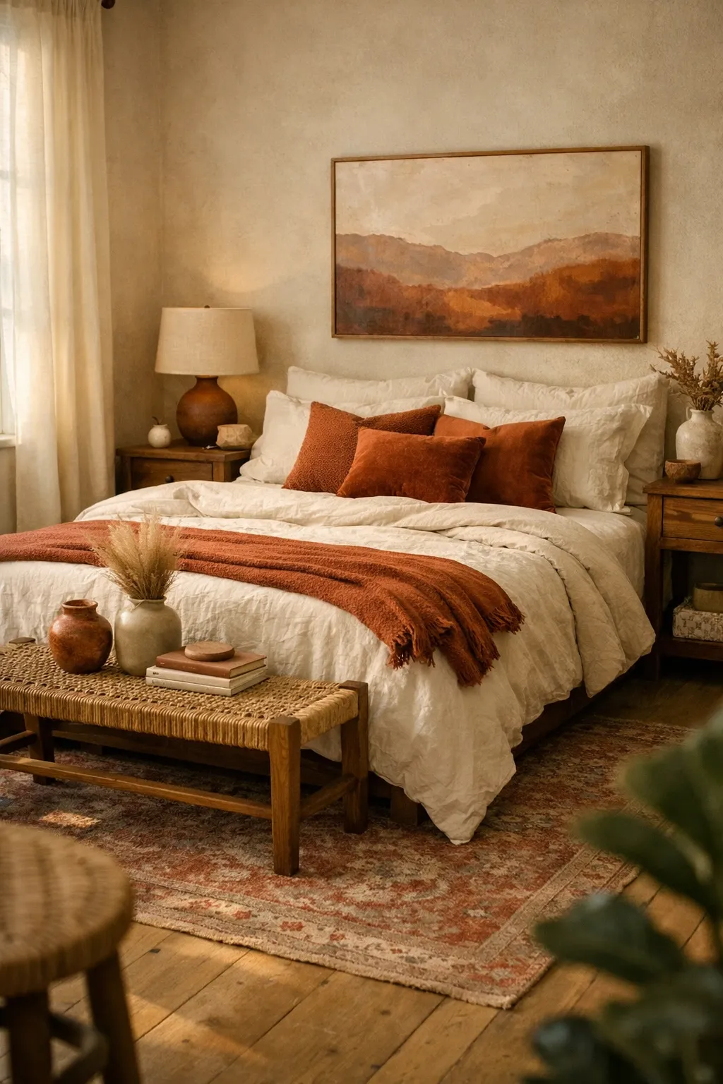
11. Rust and Cream
Rust and cream is cozy in the most obvious but still effective way. It brings warmth into a bedroom almost instantly. Rust has more depth than standard orange and more personality than beige, which makes it a great choice for people who want a room that feels inviting and a little bolder.
Cream is what keeps rust usable. Without a soft base, rust can become too heavy. Cream lightens the palette and gives it breathing room.
This pairing works especially well in:
- fall-inspired bedrooms
- boho and eclectic spaces
- rooms with lots of natural fibers
- bedrooms that need warmth
You do not need a full rust wall to make this work. Rust often looks better as an accent through pillows, a quilt, artwork, or an upholstered bench. Cream can handle the larger surfaces like bedding, curtains, and rugs.
Add wood, cane, leather, or aged brass for more depth. One strong version of this palette would be cream walls, rust velvet pillows, a warm wood bed frame, and a patterned rug with faded red-brown tones. It feels rich without being loud.
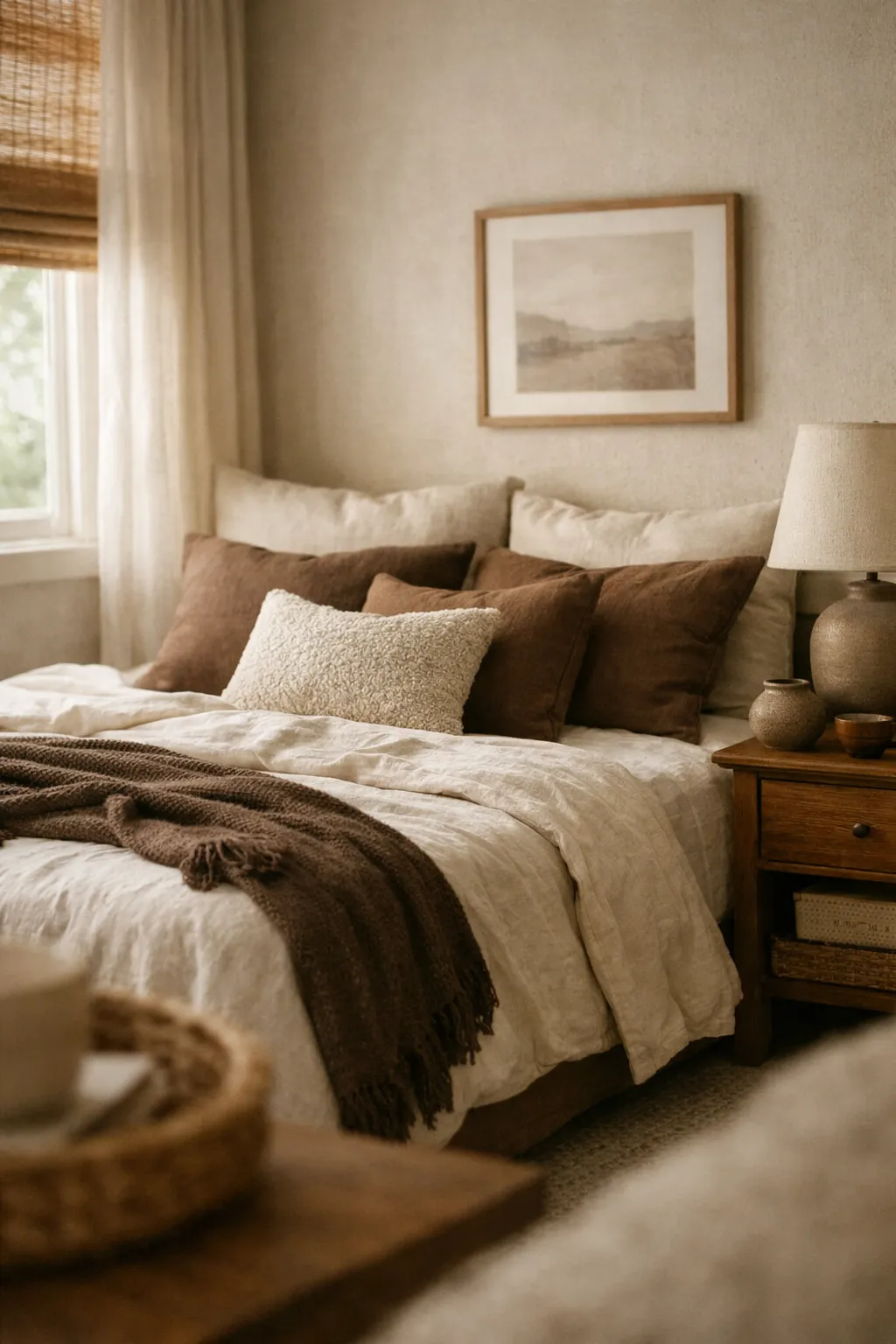
12. Mocha and Oatmeal
Mocha and oatmeal is one of the most underrated bedroom color schemes right now. It feels warm, soft, and a little elevated, especially if you are tired of gray but do not want the room to look dark.
Mocha gives you richness. Oatmeal keeps everything calm. Together, they create a layered neutral bedroom that feels cozy in a very natural way.
This palette is ideal for:
- primary bedrooms
- neutral lovers who want more depth
- bedrooms with wood furniture
- spaces that need to feel restful year-round
Use oatmeal as the lighter base through walls, curtains, and larger bedding pieces. Bring in mocha through accent pillows, a headboard, a throw, darker wood tones, or small furniture. The room will feel more balanced if the darker shade is repeated in a few places instead of sitting in only one corner.
This scheme benefits from texture more than almost any other palette here. Without texture, brown-based bedrooms can feel dull. With layered linens, woven shades, boucle, and wood grain, they feel expensive and comfortable.
13. Soft Black and Natural Linen
Soft black and natural linen is a smarter version of the black bedroom trend. Pure black can be too hard for a bedroom unless the room is large and styled extremely well. Soft black, charcoal-black, or faded black works better because it adds mood without looking severe.
Natural linen tones are what make this combination livable. They bring softness, lightness, and an organic feel that stops the room from becoming too dramatic.
This color scheme works best in:
- modern organic bedrooms
- moody but minimal spaces
- bedrooms with strong natural light
- homes with black window frames or architectural details
A soft black wall behind the bed can look great, but only if the rest of the room supports it. Pair it with linen bedding, warm wood, woven textures, and creamy off-white accents. Lighting matters a lot here. If the room only has harsh overhead light, the whole thing will feel flat and gloomy.
A better version includes soft bedside lamps, a textured rug, wrinkled linen bedding, and one or two black accents repeated throughout the room. That feels collected and intentional.
How to Choose the Right Bedroom Color Scheme
A lot of people choose colors based on one photo and then wonder why the room does not feel right. That happens because a bedroom color scheme has to match the room itself, not just your taste.
Start with these questions:
- How much natural light does the room get?
- Do you want the room to feel airy or cocoon-like?
- Are your floors warm or cool toned?
- Are you keeping your current furniture?
- Do you want a neutral base or a visible color statement?
If your bedroom gets very little light, warmer schemes like beige, cream, rust, terracotta, or oatmeal usually work better than cool gray or icy blue. If your room gets strong sunlight, you can use moodier shades like charcoal, navy, or olive more comfortably.
Also pay attention to undertones. This is where most rooms go wrong. A beige with pink undertones can clash with yellow-toned wood. A cool gray can look dead next to creamy bedding. If the undertones fight each other, the whole room feels off even if every piece looks nice on its own.
Easy Styling Moves That Make Any Bedroom Color Scheme Feel Better
Even a strong palette can fall apart if the room has no layering. Cozy bedrooms are not built by paint alone. They need visual softness and enough variation to feel lived in.
A few changes usually make the biggest difference:
- layer at least two to three bedding tones
- mix smooth and textured fabrics
- repeat your darkest color in small doses
- add warm lighting from lamps, not just ceiling fixtures
- use wood or woven pieces to break up flat color
- keep clutter low so the palette can stand out
Another practical move is to avoid matching everything too perfectly. Bedrooms look better when the pieces relate to each other instead of copying each other exactly. A room with cream, beige, oatmeal, and warm white usually looks richer than one where every textile is the same flat shade.
Conclusion
The best bedroom color schemes are not the loudest ones or the most trend-driven ones. They are the palettes that make your room feel settled, comfortable, and easy to come back to every day. A cozy stylish bedroom usually comes down to balance. You need enough softness to make the space restful and enough contrast or texture to keep it interesting.
That is why these 13 bedroom color schemes work so well. They cover different moods, different home styles, and different comfort levels with color. Some are light and quiet. Some are earthy and warm. Some are darker and more refined. None of them need a full renovation to work.
Pick the one that fits your light, your furniture, and the way you want the room to feel. Then build it slowly with bedding, rugs, curtains, lamps, and accents that support the palette. That approach works better than chasing trends, and it usually gives you a bedroom that feels stylish for much longer.