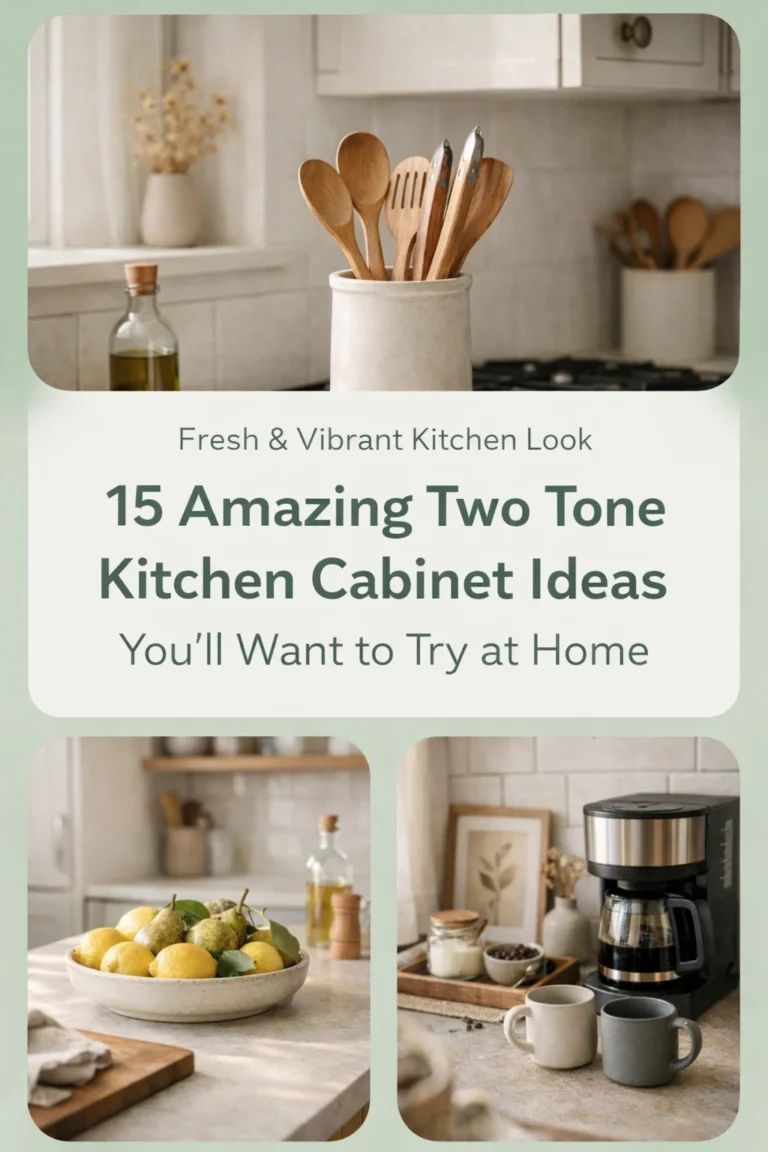


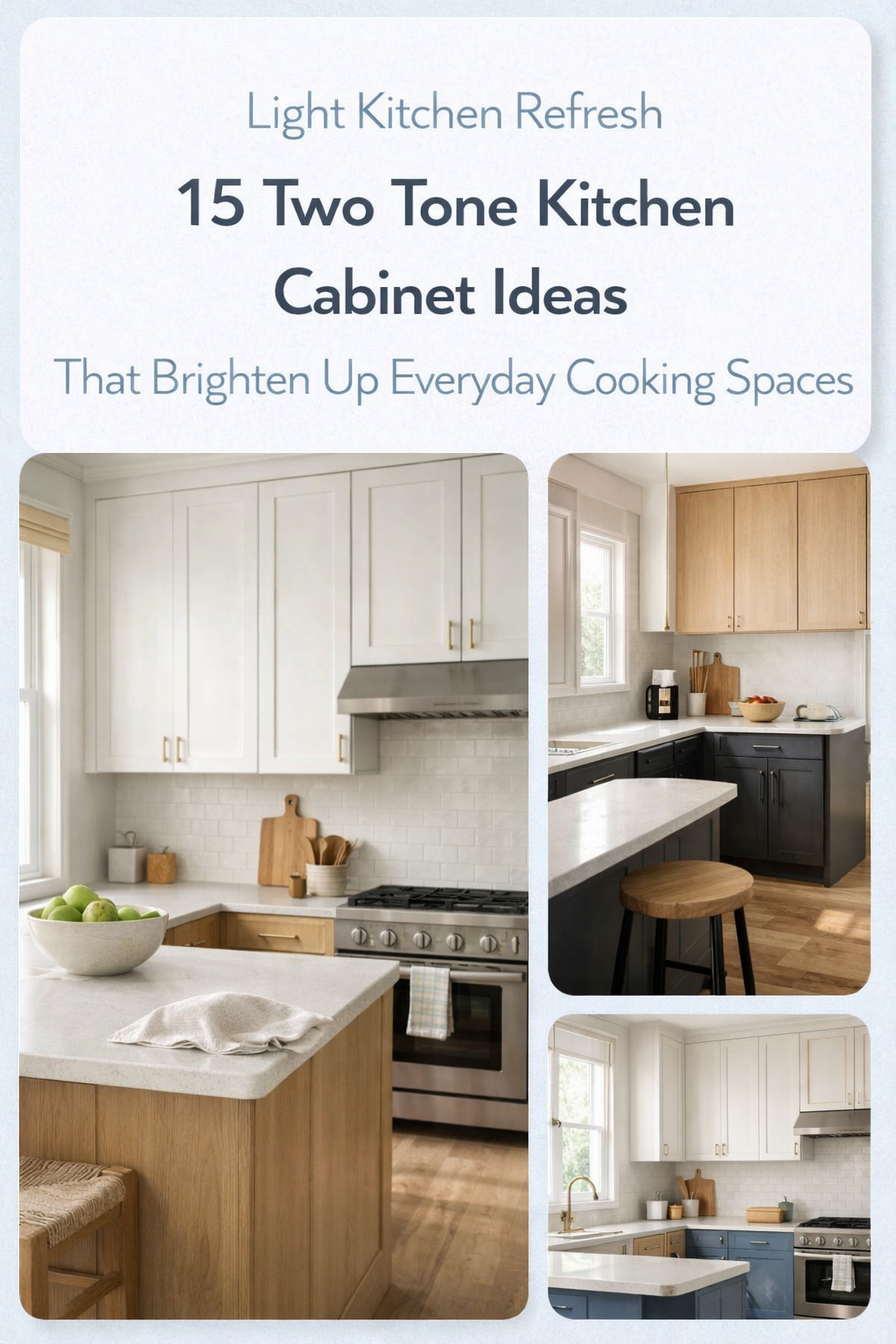
Two tone kitchen cabinets keep a kitchen from looking flat, heavy, or too one-note. They add shape, contrast, and personality without forcing you into a loud color scheme. That is why this look keeps showing up in remodels, new builds, and kitchen refreshes across the US.
The best part is simple. You do not need a massive kitchen or a designer budget to make it work. A smart cabinet pairing can help a small kitchen feel taller, a dark kitchen feel warmer, or an all-white kitchen feel more finished.
The mistake people make is treating two tone cabinets like a random color swap. Good combinations feel balanced. They connect with the countertops, backsplash, flooring, and hardware. They also fit the style of the home. A modern kitchen, a farmhouse kitchen, and a transitional kitchen do not need the same cabinet mix.
This guide breaks down beautiful cabinet combinations that work in real homes, not just in showroom photos. You will see which colors work best together, what kind of mood they create, and how to style them so the finished kitchen looks intentional.
Quick Comparison Table for Popular Two Tone Kitchen Cabinet Combinations
| Combination | Best For | Overall Feel | Works Especially Well With |
|---|---|---|---|
| White and warm wood | Small to medium kitchens | Light, warm, timeless | Quartz counters, brass, oak floors |
| Navy and white | Transitional kitchens | Crisp, classic, polished | Marble-look counters, chrome, warm white walls |
| Sage and cream | Cottage and soft modern kitchens | Calm, relaxed, welcoming | Zellige tile, brushed brass, light wood |
| Black and oak | Modern kitchens | Bold, grounded, upscale | White counters, matte black hardware, concrete accents |
| Greige and charcoal | Open-concept homes | Quiet contrast, refined | Taupe walls, stone backsplash, mixed metals |
| Dusty blue and white oak | Coastal and casual kitchens | Breezy, easy, fresh | Pale counters, woven textures, warm neutrals |
| Forest green and beige | Larger kitchens | Rich, earthy, cozy | Soapstone look, unlacquered brass, creamy walls |
| Taupe and off-white | Classic kitchens | Soft, clean, elegant | Limestone tones, aged brass, medium wood floors |
Why Two Tone Cabinets Work So Well
A single cabinet color can look beautiful, but it can also make a kitchen feel too blocky. Two tones break up visual weight. They create a natural focal point and help the room feel layered.
This matters even more in kitchens with lots of cabinetry. When every cabinet is dark, the room can feel heavy. When every cabinet is bright white, the kitchen can start to feel plain. A second tone fixes that problem fast.
Two tone cabinets also let you mix function with style. Darker lowers can hide scuffs better. Lighter uppers can make the room feel more open. A stained island can add warmth in a kitchen full of painted cabinets.
How to Choose the Right Cabinet Pairing
Before you pick colors, look at these four things:
- Natural light in the room
- The undertone of your flooring
- Countertop and backsplash materials
- The style of your home
A cool white and a cool gray-blue may look great together, but they can fight with orange-toned floors. A warm beige and walnut combination can look rich and soft, but in a dark room it may need lighter counters to keep the space from closing in.
As a rule, use one tone as the main base and the second tone as support. Most kitchens look better when one color clearly leads.
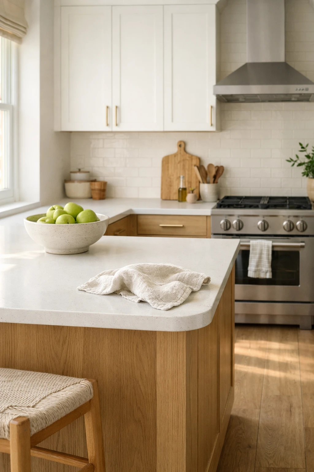
1. White Upper Cabinets and Warm Wood Lower Cabinets
This is one of the safest and strongest two tone kitchen cabinet combinations you can choose. It gives you brightness on top and warmth below, which makes the whole room feel open but not sterile.
White upper cabinets bounce light around the room. Wood lower cabinets add texture, grain, and depth. Together, they create a kitchen that feels custom even when the layout is simple.
Why this pairing works
The contrast is gentle, not harsh. That makes it easy to live with long term. It also fits a wide range of styles, from Scandinavian-inspired kitchens to modern farmhouse spaces.
Best styling ideas
Use white quartz or a soft marble-look countertop to keep the kitchen bright. Add aged brass or black hardware depending on the look you want. Light oak, walnut, or white oak all work well for the lower cabinets.
In a small kitchen, flat-panel wood lowers and simple shaker uppers keep the space clean and calm.
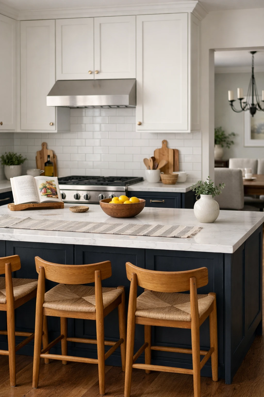
2. Navy Lower Cabinets and White Upper Cabinets
Navy and white is a classic for a reason. It feels crisp, grounded, and polished without looking trendy in a bad way. Navy adds enough depth to make the kitchen feel finished, while white keeps it from getting too dark.
This combination works especially well in kitchens that need a bit more structure. It gives the room visual weight near the floor and makes upper cabinets feel lighter.
Where it works best
It is a strong choice for transitional kitchens, family kitchens, and homes that mix traditional details with cleaner finishes. It also works well if you want color without going too bright.
How to keep it timeless
Choose a muted or slightly dusty navy instead of a super-saturated blue. Pair it with white subway tile, soft white walls, and polished nickel or brushed brass hardware. If the room already has cool gray flooring, warm up the space with wood stools or a warm runner.
A navy island in a mostly white kitchen can create a similar effect if you want less commitment.
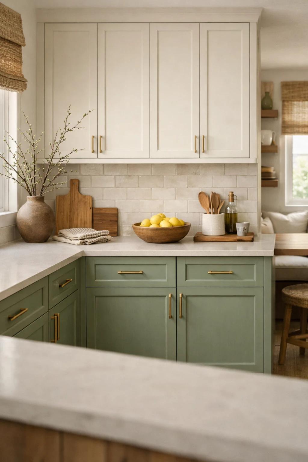
3. Sage Green Cabinets and Cream Cabinets
Sage and cream feel soft, welcoming, and a little more personal than the usual white-and-blue kitchen. This pairing has a relaxed look that suits homes where you want the kitchen to feel calm rather than formal.
Sage works best when it has gray or earthy undertones. Cream softens the whole palette and keeps the green from reading too cool.
Why homeowners love it
This combination feels fresh but still lived-in. It looks good in morning light, works beautifully with natural materials, and gives the kitchen color without shouting for attention.
Best finishes for this look
Think warm white walls, creamy quartz counters, handmade-style tile, and brushed brass hardware. Open shelving in natural wood can tie both cabinet colors together.
This is a great pick for cottage kitchens, updated traditional homes, and anyone tired of stark bright white.
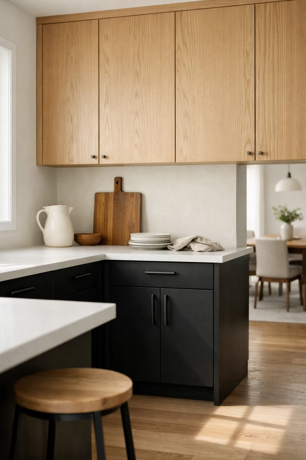
4. Black Lower Cabinets and Natural Oak Upper Cabinets
This pairing has strong contrast, but it can look incredibly clean and expensive when done right. Black lower cabinets ground the kitchen. Natural oak uppers bring back warmth and texture.
It is a smart choice for modern kitchens that need warmth. All-black kitchens can feel too severe. All-oak kitchens can sometimes lack definition. Putting the two together fixes both problems.
What makes it look high-end
The magic is in the finish choices. A soft matte black looks better than a shiny black. Rift-cut or white oak uppers look more refined than orange-toned wood. Simple slab doors help the look stay sharp.
What to watch out for
This combination needs balance. Use lighter countertops and a backsplash that reflects light. If the room is already dark, add under-cabinet lighting and keep wall color warm and soft.
In a real home, this looks great with white quartz, black window frames, and a few ceramic or linen accents to soften the edges.
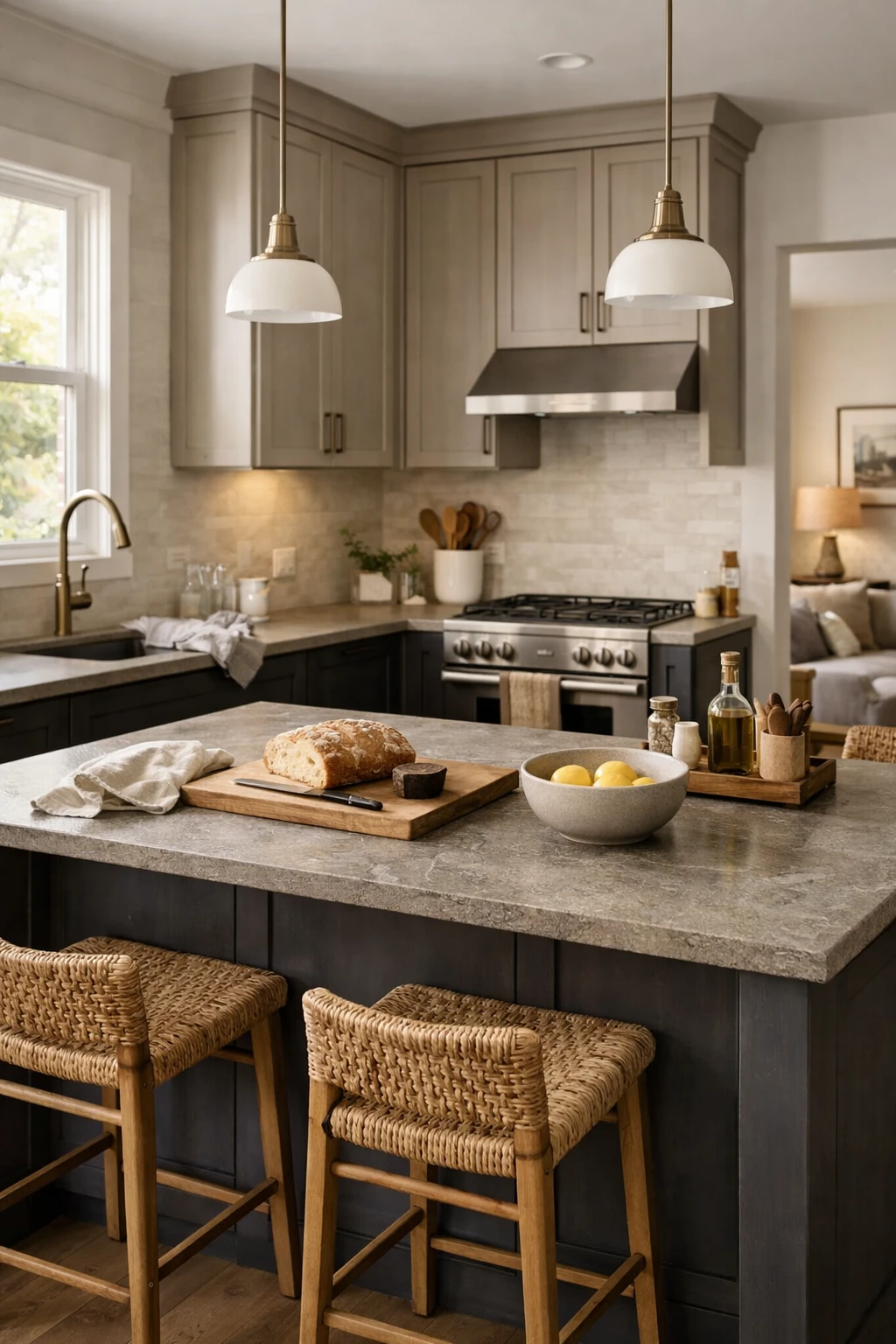
5. Greige Cabinets and Charcoal Cabinets
If you want contrast without a strong color statement, greige and charcoal is one of the smartest choices. It feels layered, quiet, and polished. This is the kind of kitchen palette that ages well because it does not rely on trendy shades.
Greige brings warmth and softness. Charcoal adds depth without the full severity of black. Together, they create a subtle custom look.
Best use for this pairing
This works especially well in open-concept homes where the kitchen needs to connect with living and dining spaces. The colors are flexible, which makes them easier to coordinate with nearby furniture and finishes.
Styling notes
Pair these cabinets with stone-look counters, taupe or warm white walls, and mixed metal accents. Charcoal often works best on the island or lower cabinets, while greige can carry the taller cabinetry or uppers.
This pairing is a strong option if you want something elegant and low-drama.
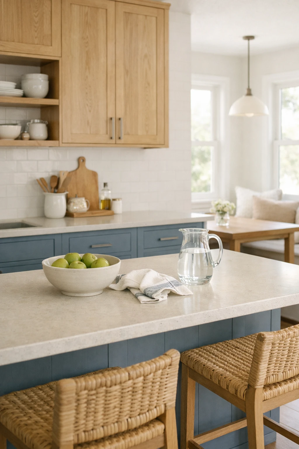
6. Dusty Blue Cabinets and White Oak Cabinets
Dusty blue and white oak give a kitchen a fresh, airy feel without pushing too far into beach-theme territory. The blue adds color, but the wood keeps it grounded and natural.
This is one of those pairings that photographs beautifully but also works in daily life. It feels relaxed, easy, and bright.
Who should consider it
Homeowners who like coastal, casual, or soft modern kitchens usually do well with this combination. It is also a good fit for kitchens that get decent natural light and need a gentle color lift.
How to style it well
Choose a dusty blue with gray in it, not a bright primary blue. White oak works well because it has a clean grain and a soft warmth. Add woven stools, pale countertops, and simple white or cream backsplash tile.
This pairing looks especially nice when the island is blue and the perimeter cabinets are wood or off-white.
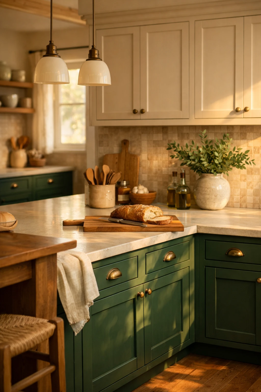
7. Forest Green Lower Cabinets and Beige Upper Cabinets
Forest green and beige create a moodier, richer kitchen, but the beige keeps things approachable. This pairing works when you want depth and warmth at the same time.
Forest green has more presence than sage. It feels deeper and more rooted. Beige softens it and makes the whole palette easier to use in family homes.
Why this combination feels grounded
It pulls from nature without looking rustic in a forced way. The green adds weight and character. The beige adds softness and helps the kitchen feel more inviting.
Best supporting materials
Try creamy counters, a warm tile backsplash, medium-toned wood floors, and unlacquered brass or antique brass hardware. If you have a large kitchen with tall ceilings, this combination can make the room feel more intimate.
It is a great fit for transitional, English-inspired, and warm modern kitchens.
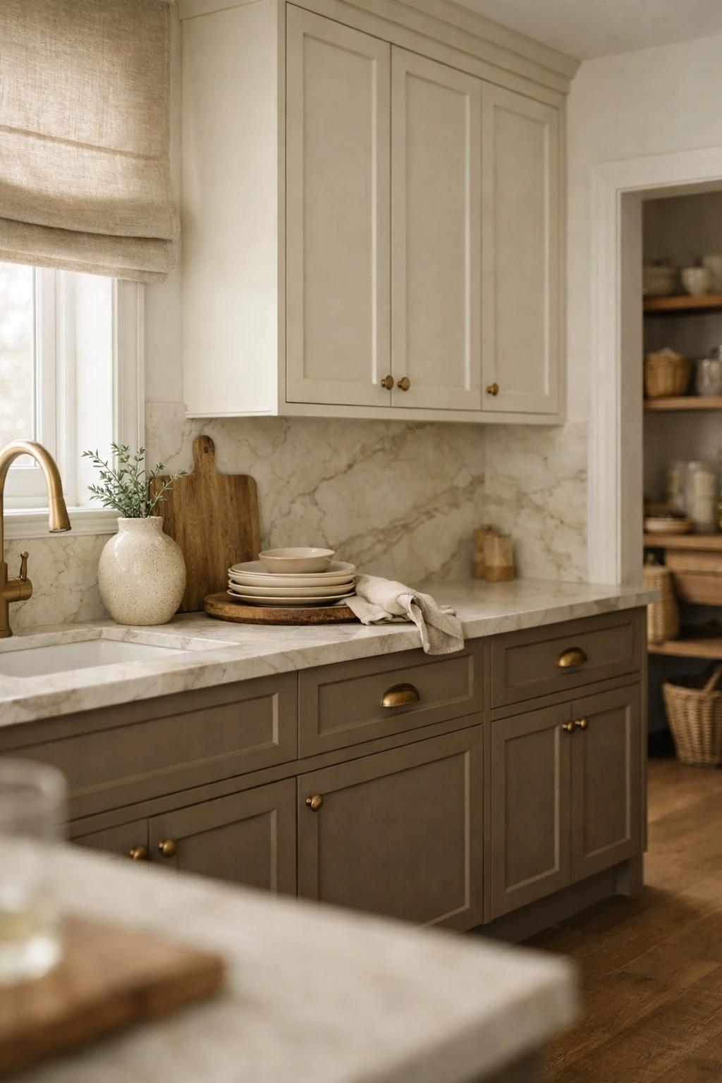
8. Taupe Lower Cabinets and Off-White Upper Cabinets
Taupe and off-white may sound subtle, but that is exactly the point. This pairing gives you contrast without drama. It feels clean, elegant, and easy to decorate around.
Taupe adds depth in a softer way than gray, black, or navy. Off-white feels warmer and more forgiving than bright white. Together, they create a kitchen that looks settled and calm.
Why it works in so many homes
This is one of the easiest two tone combinations to fit into existing spaces. It works with many floor colors, does not fight with warm finishes, and feels classic without looking old.
Practical styling tips
Use warm marble-look quartz, aged brass hardware, and simple shaker cabinets for a timeless result. Add texture through wood cutting boards, linen shades, or ceramic vases instead of pushing the color palette too far.
This is the kind of kitchen that still looks good years later because it is based on tone and balance, not shock value.
Here’s the second half of the article, followed by the full image prompt section.
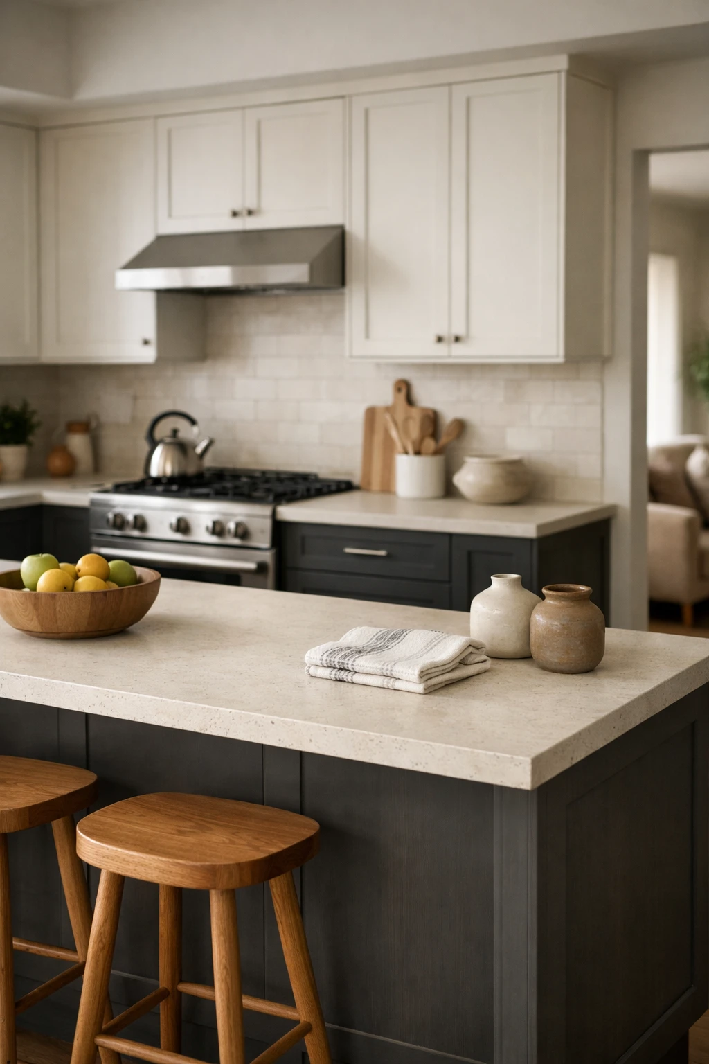
9. Charcoal Lower Cabinets and Soft White Upper Cabinets
Charcoal and soft white give you strong contrast without the full sharpness of black and bright white. This combination feels tailored, clean, and a little more relaxed than the navy-and-white look.
Charcoal lowers hide daily wear well, which makes them a smart choice for busy family kitchens. Soft white uppers keep the room open and stop the darker base from feeling too heavy.
How to make it feel warm
The easiest mistake here is making the kitchen feel cold. Fix that with warm white walls, wood stools, and stone or quartz counters with creamy undertones. If your flooring leans cool, bring in texture through woven shades, oak shelves, or wood-framed counter stools.
This pairing works well in transitional and modern classic kitchens where you want contrast that still feels easy to live with.
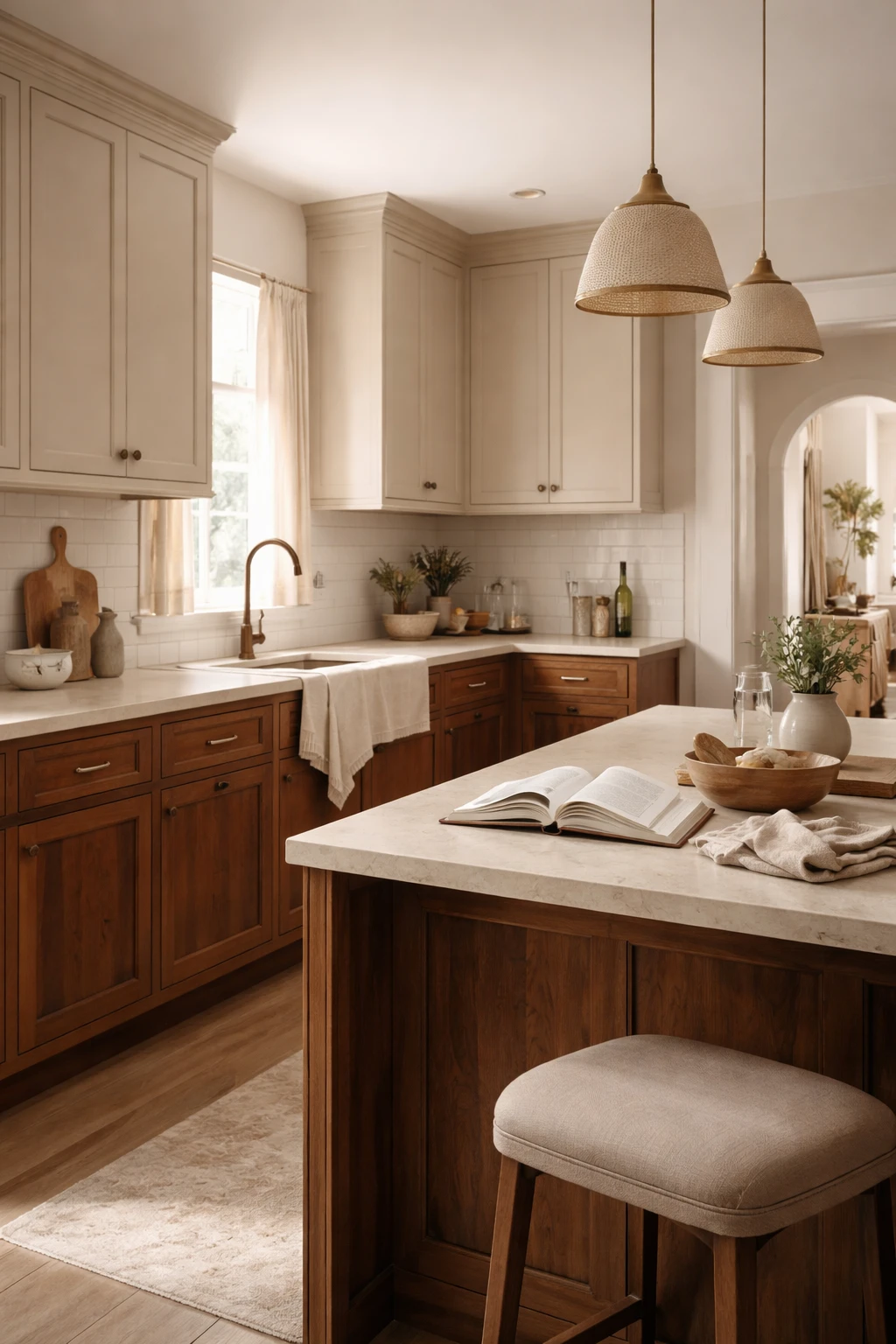
10. Mushroom Cabinets and Walnut Cabinets
Mushroom is one of those colors that works harder than people expect. It sits between beige, taupe, and gray, which makes it flexible and soft. Pair it with walnut, and the kitchen feels rich without becoming dark or formal.
This combination works best when the walnut has a warm chocolate tone and the mushroom paint has clear warmth. If either one turns too gray, the room can lose that inviting look.
Why this mix feels elevated
It has depth, but it does not scream for attention. That makes it ideal for homeowners who want a kitchen that looks custom and expensive without relying on bold color.
Try mushroom perimeter cabinets with a walnut island, or use walnut lowers if you want more wood in the room. Creamy counters, linen Roman shades, and bronze or aged brass hardware work beautifully here.
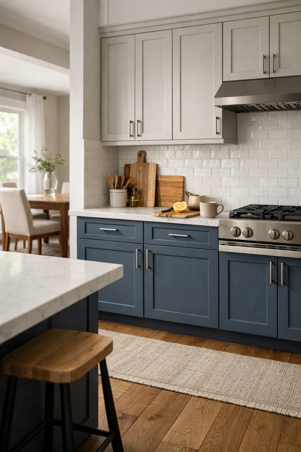
11. Slate Blue Lower Cabinets and Pale Gray Upper Cabinets
Slate blue and pale gray create a cooler, more tailored palette. This pairing feels calm and polished, and it works well in homes that already have cooler finishes like gray stone, brushed nickel, or stainless steel.
Slate blue has more depth than powder blue, so it gives the kitchen shape without feeling playful. Pale gray uppers soften the contrast and keep the room from feeling top-heavy.
When this pairing looks best
It works best in kitchens with decent daylight and a clean, structured layout. If the room is dark, choose a very light gray on top and use warmer wood accents to keep things balanced.
A white backsplash with a little texture, like handmade subway tile or a quiet stacked tile, helps this color combination feel less flat. It is a smart fit for coastal transitional and updated traditional kitchens.
12. Cream Perimeter Cabinets and Dark Walnut Island Cabinets
This is one of the best two tone kitchen cabinet combinations for homeowners who want the kitchen to feel warm, classic, and a little more custom without coloring every cabinet. Cream perimeter cabinets keep the room soft and bright. A dark walnut island adds contrast, richness, and a natural focal point.
It is a great option if you want two tones but still prefer a mostly neutral kitchen.
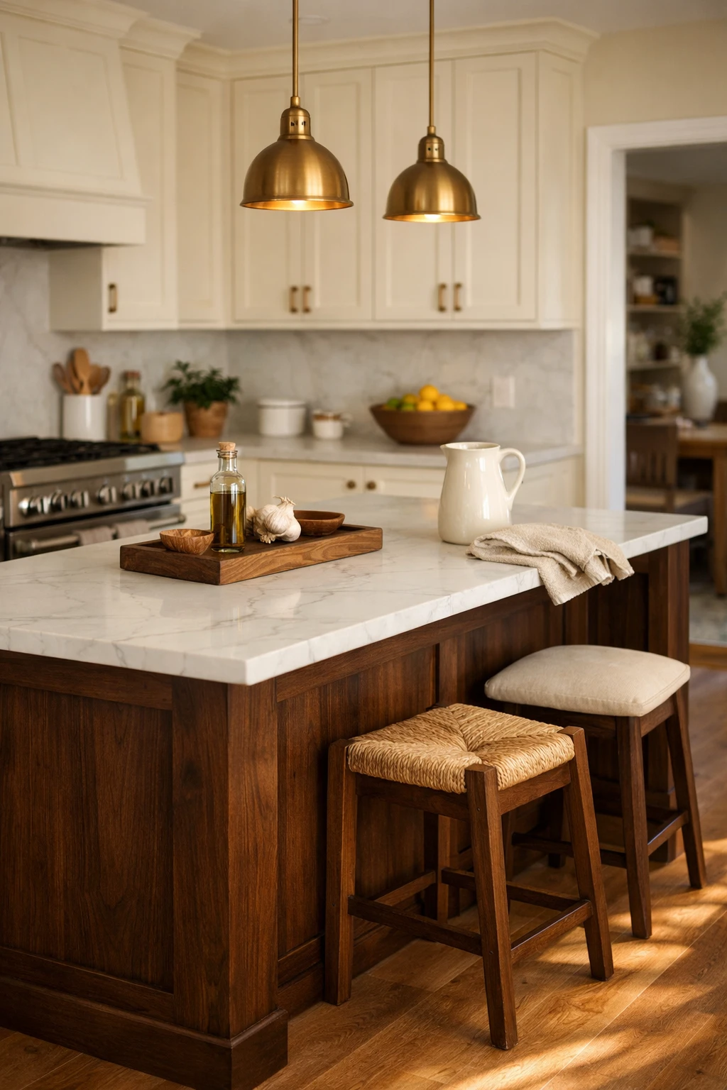
Why the island-first approach works
A contrasting island draws the eye to the center of the room without crowding the rest of the space. It also gives you room to use deeper wood tones in a controlled way.
This look pairs well with marble-look quartz, warm brass pendants, wood floors, and simple shaker or recessed-panel cabinets. In a real family kitchen, it feels elegant without being fragile.
13. Putty Beige Cabinets and Olive Green Island Cabinets
Putty beige is softer than taupe and a little dirtier than cream, which is exactly why it works so well in kitchens. It creates a quiet backdrop. Add an olive green island, and the whole room gets depth and personality without drifting into theme decor.
Olive green feels grounded and natural. It works well with warm metals, stone finishes, and handmade-looking tile.
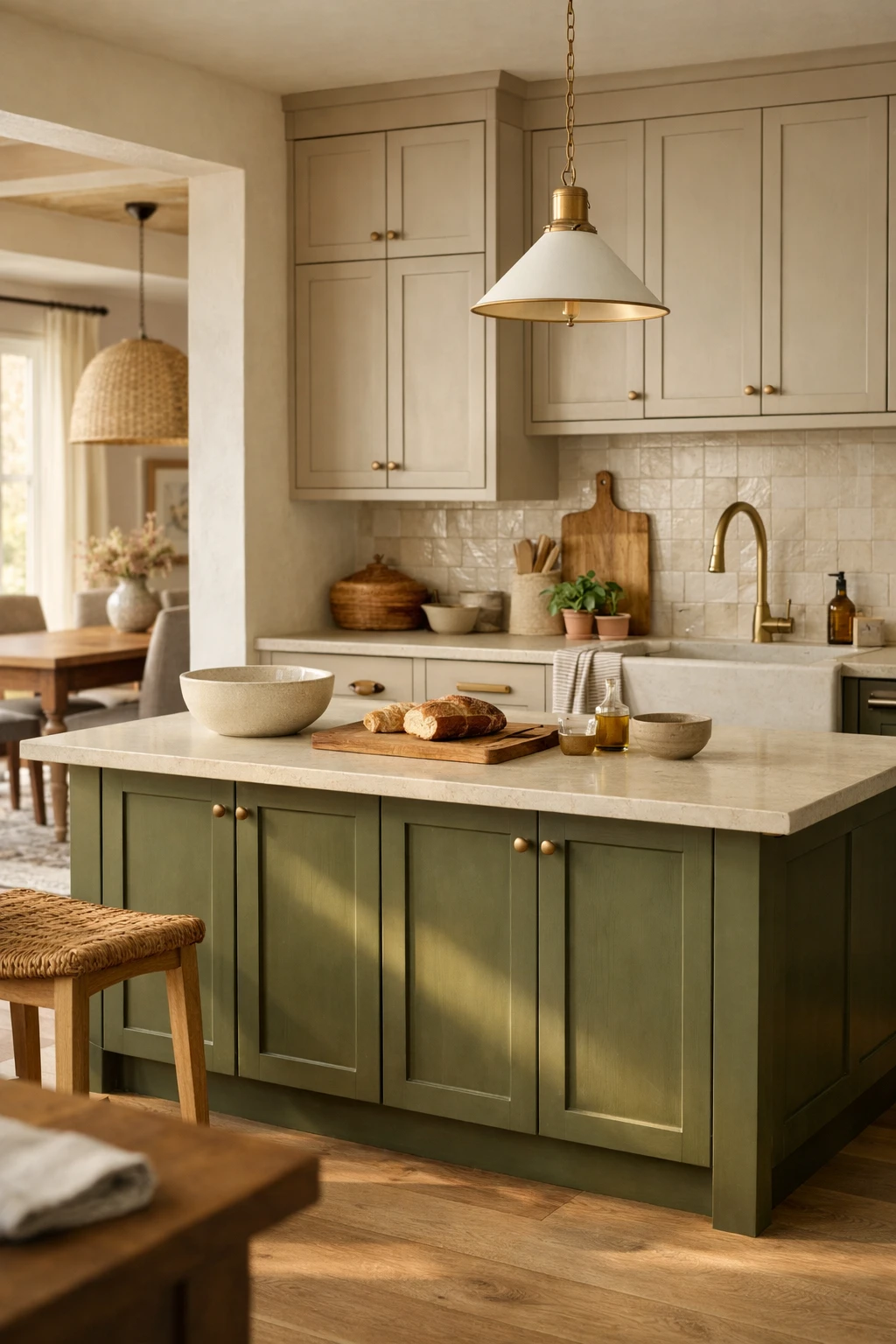
Best homes for this color combination
This pairing suits warm modern, European-inspired, and updated farmhouse kitchens. It also works well in homes where the kitchen opens to living spaces with warm woods, linen textures, and earthy neutrals.
Use the olive on the island only if you want a safer entry into color. That single move can make a plain beige kitchen feel far more thoughtful.
14. Soft Gray Cabinets and Natural Maple Cabinets
Soft gray cabinets can still work when they are balanced with the right wood. Natural maple brings light warmth and a smoother, cleaner grain than some darker woods. Together, they create a kitchen that feels simple, fresh, and easy to maintain.
This combination is useful when you want something neutral but less expected than white and oak.
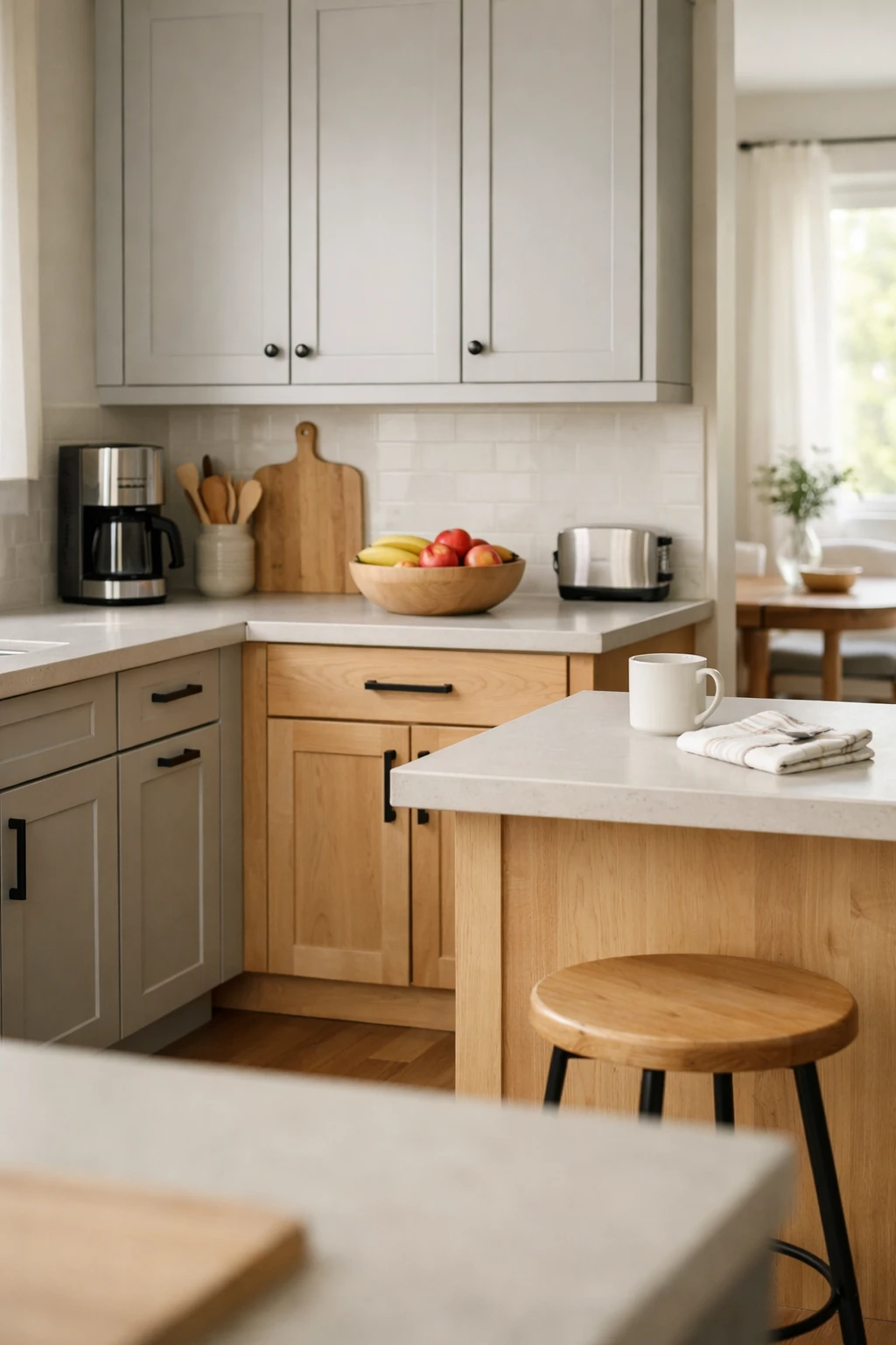
How to stop it from feeling dated
The danger with gray is not the color alone. It is the wrong undertone. Skip icy gray. Go for a soft warm gray or a barely-there gray with beige mixed in. That keeps the palette current and easier to pair with natural materials.
Flat-panel or skinny shaker doors help this look feel fresh. Add clear glass pendants, pale counters, and matte hardware to keep the kitchen clean and relaxed.
15. Warm White Cabinets and Mocha Brown Island Cabinets
Warm white and mocha brown give you contrast in a softer, richer way than black, charcoal, or navy. This combination works well for homeowners who want a kitchen that feels welcoming and grounded.
Warm white cabinets brighten the room and play well with many wall colors. A mocha brown island adds depth and gives the space a furniture-like focal point.
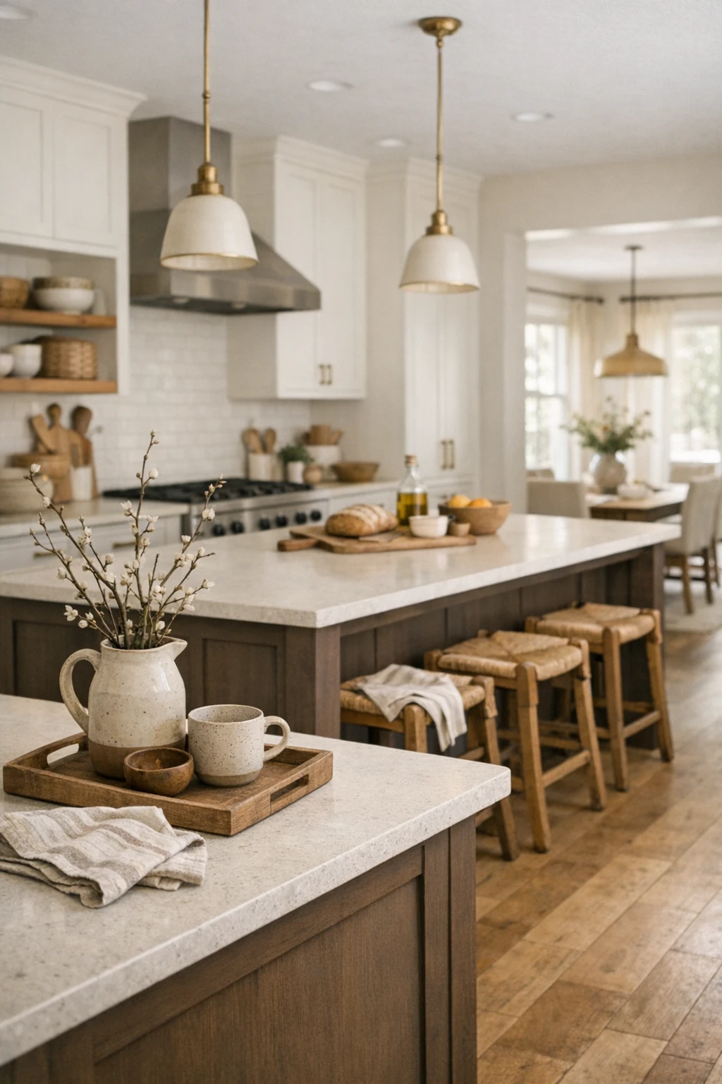
Why this combination has staying power
It does not rely on trend-heavy colors. It is built on warmth, which makes it easier to keep looking good as other decor changes. You can take it a little more modern with clean lines and matte finishes, or more classic with panel detailing and aged brass.
This is a strong choice for open kitchens that need a little visual anchor in the center of the room.
Common Mistakes That Make Two Tone Cabinets Look Off
Two tone kitchens look easy, but a bad pairing can make the room feel chopped up fast. Most problems come from poor balance, not from the idea itself.
Watch out for these mistakes:
- using two colors with clashing undertones
- choosing contrast that is too harsh for the size of the room
- ignoring the floor color
- using a dark upper cabinet color in a kitchen with weak natural light
- adding too many statement finishes at once
- picking trendy paint colors without checking how they work with counters and backsplash
If you want a kitchen that ages well, let one finish lead and let the second one support it.
How to Make Any Two Tone Kitchen Feel Cohesive
Color pairing is only half the job. The rest comes from repetition and balance.
Use these moves to make the space feel tied together:
- repeat a wood tone somewhere else in the room
- echo cabinet warmth in flooring, stools, or open shelves
- choose hardware that fits both cabinet colors
- keep counters and backsplash simple if the cabinet contrast is strong
- use one wall color that connects the whole palette
A real kitchen does not need to look perfect. It needs to feel settled. That usually comes from texture, tone, and restraint more than from bold color choices.
Final Thoughts
The best two tone kitchen cabinet combinations do not just look pretty in photos. They solve real design problems. They can lighten a heavy kitchen, warm up a plain one, or add contrast to a space that lacks shape.
If you want the safest route, white and wood, taupe and off-white, and cream with walnut are hard to beat. If you want more contrast, navy and white, black and oak, and forest green with beige have more presence. If you want a softer look that still feels current, sage and cream or putty beige with olive are strong options.
Pick a pairing that fits your light, your flooring, and the mood you want every day. That is what makes a kitchen feel custom instead of copied.